Themes
Theming consists of two main steps.
- Change the colors of the screen elements and components - background, text, buttons etc.
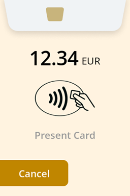
- Adding a 'letterbox' logo to the top of the screen.
For color scheme changes, there are two choices; Built In Themes, or customizing all the colors
Built In Themes
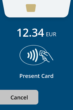
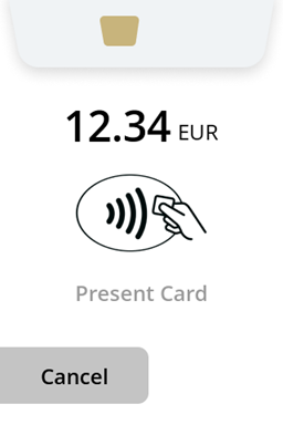
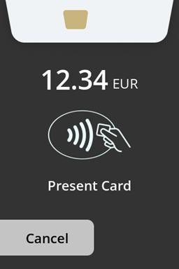
The terminal is preloaded with 3 default themes: Default, Light and Dark.
Customizing a Theme
Custom themes can be created with a custom theme configuration. Custom themes provide the means to change various aspects of the UI such as background colour, button colour and font / icon colour.
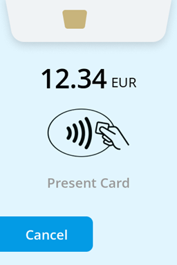
UI Theme settings can be defined in MyPayter via specific advanced configuration settings. Alternatively a custom theme definition can be created by Payter so that it can be selected by name.
Theme settings can be applied to the following elements:
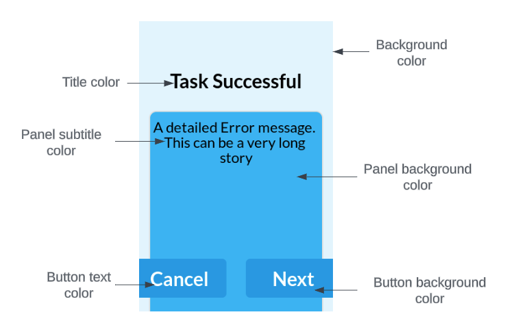
Theme Colors
| Element | MyPayter Key | Value |
|---|---|---|
| Background color | background-color | RGB Hex color (e.g. e1f5fe) |
| Button background color | button-color | RGB Hex color (e.g. 039be5) |
| Button text color | button-label-color | RGB Hex color (e.g. ffffff) |
| Panel background color | panel-color | RGB Hex color (e.g. 29b6f6) |
| Panel title color | panel-label-color | RGB Hex color (e.g. 000000) |
| Panel subtitle color | panel-sub-label-color | RGB Hex color (e.g. 6a6a6a) |
| Progress bar / Spinner background color | slider-bg-color | RGB Hex color (e.g. 000000) |
| Progress bar / Spinner foreground color | slider-fg-color | RGB Hex color (e.g. 2e5c71) |
| Title color | title-color | RGB Hex color (e.g. 5b2c6a) |
| Style of built in icons | icons-color | Some icons, such as NFC landing icons, are built into the UI. There are two possible colors: White = 0 Black = 1 |
| Top Logo | logo-image | Asset name of logo to display at top of most screens. |
Contrast Checker
In order to ensure all text can be read, the terminal will check the contrast between different text and objects on screen.
If there is not sufficient contrast the Apollo terminal will deny the configuration and use default settings instead.
There are two different levels of contrast:
- Contrast between text and its background
- Contrast between objects and their background
The contrast for text is more important, therefore the requirements are stricter. Text needs a contrast ratio of 3 : 1 or higher to be accepted. Objects have less strict requirements, needing a ratio of 1.1 : 1 to be accepted. So the contrast between the elements has to comply to this table:
| Background element | Foreground element | Minimal contrast ratio |
|---|---|---|
background-color | button-color | 1.1 : 1 |
background-color | title-color | 1.1 : 1 |
background-color | panel-color | 1.1 : 1 |
background-color | slider-bg-color | 1.1 : 1 |
background-color | title-color | 3 : 1 |
button-color | buton-label-color | 3 : 1 |
panel-color | panel-label-color | 3 : 1 |
slider-bg-color | slider-fg-color | 3 : 1 |
The contrast can be verified beforehand using an online color contrast checker such as WebAIM: Contrast Checker.
If the configuration supplied does not meet the software’s contrast requirements, the UI setting will not be applied at all. There is no error message implemented at this time.
Theme Assistance
Payter’s Product Delivery & Implementation team are on hand to provide assistance with configuring custom themes.
Adding a Logo
A logo can be placed at the top of most screens via the logo-image theme setting. The logo will be centered at the top of the screen with a maximum size of 320x80px. More information can be found on our Assets page.