Dialog
The dialog screen can be used to display a small result message with the option to add one or two buttons for customer interaction. An approval (green mark) or a declined (red cross) icon can be shown within the dialog.
Screen Type Id : dialog
Properties
| Key | Type | Description |
|---|---|---|
title | utf-8 string | The primary title field on the screen. The field wraps when text overflows the width. |
message | utf-8 string | Small message at the top of the attention panel. If icon is not used, then the message field is capable of utilizing the space below itself. |
icon | enum | The icon to be displayed. This can be either: approved declined |
buttons.(name) | empty | Adding a property with prefix buttons will add a button. The first button in the map is the left button and the second the right. |
| buttons.(name).label | utf-8 string | The label text on the button. |
| buttons.(name).transp | boolean | Set to true to make the button transparent |
Examples
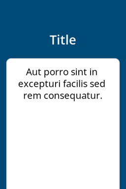
- Message
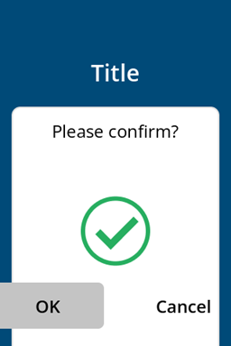
- Confirmation 1
- Confirmation 2
curl -X 'POST' ${CPS_UI_URL} \
  -H 'Authorization: CPS apikey="'${CPS_API_KEY}'"' \
  -H 'Content-Type: application/json' \
  -d '{
    "id": "my-dialog-screen",
    "type": "dialog",
    "properties": {
      "title": "Title",
      "message": "Aut porro sint in excepturi facilis sed rem consequatur."
    }
  }'
curl -X 'POST' ${CPS_UI_URL} \
  -H 'Authorization: CPS apikey="'${CPS_API_KEY}'"' \
  -H 'Content-Type: application/json' \
  -d '{
    "id": "my-dialog-screen",
    "type": "dialog",
    "properties": {
      "title": "Title",
      "message": "Please confirm?",
      "icon": "approved",
      "buttons.ok": "",
      "buttons.ok.label": "OK",
      "buttons.cancel": "",
      "buttons.cancel.label": "Cancel"
    }
  }'
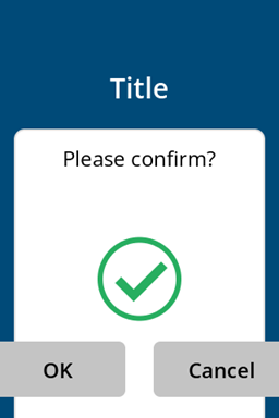
curl -X 'POST' ${CPS_UI_URL} \
  -H 'Authorization: CPS apikey="'${CPS_API_KEY}'"' \
  -H 'Content-Type: application/json' \
  -d '{
    "id": "my-dialog-screen",
    "type": "dialog",
    "properties": {
      "title": "Title",
      "message": "Please confirm?",
      "icon": "approved",
      "buttons.ok": "",
      "buttons.ok.label": "OK",
      "buttons.cancel": "",
      "buttons.cancel.label": "Cancel",
      "buttons.cancel.transp": "true"
    }
  }'