Selection
The selection screen can be used to provide a list of items from which the user can select. Each item acts as a button generating a UI Event in the same way as other button presses.
Screen Type Id : selection
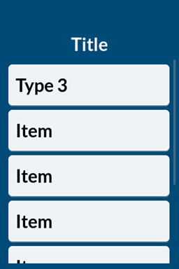
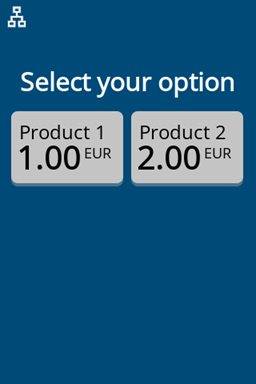
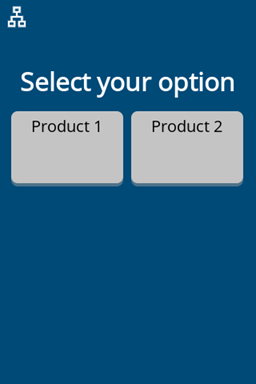
There are 4 styles of selection UI which are selected by the type property.
| Type 0 Product Long | Type 1 Product Short | Type 2 Product Item Short | Type 3 Item List |
|---|---|---|---|
 |  |  |  |
Properties
| Key | Type | Description |
|---|---|---|
title | utf-8 string | The primary title field on the screen. The field wraps when text overflows the width. |
type | enum | See above 0, 1, 2, or 3 |
items.<name> | empty | Adding a property adds an item to the selection menu. |
items.<name>.label | utf-8 string | The text label of the item. |
items.<name>.amount | utf-8 string | The amount of the item, note that this is a string so must be formatted as needed by the caller. Note: Only applies to Type 0 and 1. |
items.<name>.currency | utf-8 string | Currency string to display for the item. Note: Only applies to Type 0 and 1. |
items.<name>.ico | ascii string | Optional icon to display for the item. See Assets Note: Only applies to Type 2 and 3. |
items.<name>.value | utf-8 string | Value of the item. Note: Only applies to Type 2. |
| items.<name>.disabled | boolean | If set to true the button will be disabled. |
Examples
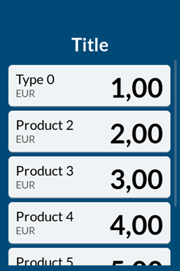
- Type 0
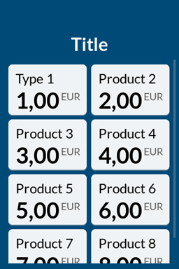
- Type 1
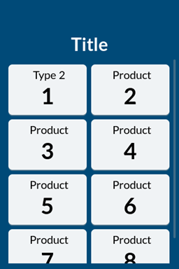
- Type 2
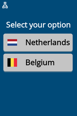
- Type 3
curl -X 'POST' ${CPS_UI_URL} \
  -H 'Authorization: CPS apikey="'${CPS_API_KEY}'"' \
  -H 'Content-Type: application/json' \
  -d '{
    "id": "my-selection-screen",
    "type": "selection",
    "properties": {
        "title": "Select your option",
        "type": "0",
        "items.prod1": "",
        "items.prod1.label": "Product 1",
        "items.prod1.amount": "1.00",
        "items.prod1.currency": "EUR",
        "items.prod2": "",
        "items.prod2.label": "Product 2",
        "items.prod2.amount": "2.00",
        "items.prod2.currency": "EUR",
        "items.prod2.disabled": "true"
    }
  }'
curl -X 'POST' ${CPS_UI_URL} \
  -H 'Authorization: CPS apikey="'${CPS_API_KEY}'"' \
  -H 'Content-Type: application/json' \
  -d '{
    "id": "my-selection-screen",
    "type": "selection",
    "properties": {
        "title": "Select your option",
        "type": "1",
        "items.prod1": "",
        "items.prod1.label": "Product 1",
        "items.prod1.amount": "1.00",
        "items.prod1.currency": "EUR",
        "items.prod2": "",
        "items.prod2.label": "Product 2",
        "items.prod2.amount": "2.00",
        "items.prod2.currency": "EUR"
    }
  }'
curl -X 'POST' ${CPS_UI_URL} \
  -H 'Authorization: CPS apikey="'${CPS_API_KEY}'"' \
  -H 'Content-Type: application/json' \
  -d '{
    "id": "my-selection-screen",
    "type": "selection",
    "properties": {
        "title": "Select your option",
        "type": "2",
        "items.prod1": "",
        "items.prod1.label": "Product 1",
        "items.prod2": "",
        "items.prod2.label": "Product 2",
        "items.prod2.disabled": "true"
    }
  }'
curl -X 'POST' ${CPS_UI_URL} \
  -H 'Authorization: CPS apikey="'${CPS_API_KEY}'"' \
  -H 'Content-Type: application/json' \
  -d '{
    "id": "my-selection-screen",
    "type": "selection",
    "properties": {
        "title": "Select your option",
        "type": "3",
        "items.prod1": "",
        "items.prod1.label": "Netherlands",
        "items.prod1.ico": "nl",
        "items.prod2": "",
        "items.prod2.label": "Belgium",
        "items.prod2.ico": "be"
    }
  }'