Adapting Built-In Screens
Payter provide seven built in screens as standard. It is possible to use each of these screens as a base, and add element(s) to them to suit the design. This is really useful if you want only a minor change, such as adding a Progress bar to an info screen, or adding dialog buttons to a selection screen.
The Adapt Existing section of the guide details the specifics of how to achieve this level of customization, but below is an example of each of the screens, with their elements noted.
Info Screen
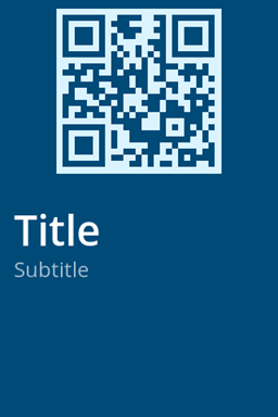
The info screen has no interactive elements, but currently allows a 'background' image to be used, with an optional QR code, and a 'title' and 'subtitle' label. The 'subtitle' 'label' is aligned to the bottom of the title label and the title to the bottom of the qr code element, or the top of the screen if the qr element does not exist.
Notification Screen
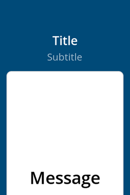
Notification is a screen which supports a 'title' and 'subtitle' labels in the upper part of the screen, then dedicates a container beneath it with prominent 'message' label. This screen can also show an appropriate 'Approved/Declined' 'icon' (image) when these fields are passed in. You can see an example of this in the Built-In Screen page.
Dialog Screen
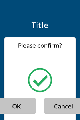
The dialog screen can be used to display a small result message with the option to add one or two buttons for customer interaction. There is a title label, then a container as in the Notification screen. The label for the message is smaller than Notification though, but 'icon' (image) continues to be supported. The key difference are two buttons near the bottom of the screen. Note that these are actually a label element as a child of the button element.
Selection Screens
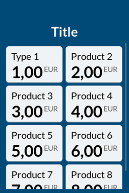
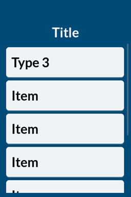
Selection screens are available in several types. They all have a 'title' label at the the top of the screen. Each one then varies the size of the button, and the layout of internal labels, or both. This screen also scrolls to include more buttons than a standard screen allows. The different types are viewable in our Built In Screens section.
Spinner Screen

The Spinner screen consists of a 3 labels; 'amount' and 'currency' above the spinner element, and 'title' at the bottom of the screen. Whilst it is possible to base a screen from this, the relative simplicity of this built in screen means it is likely easier to use the core elements themselves.
Carousel Screen
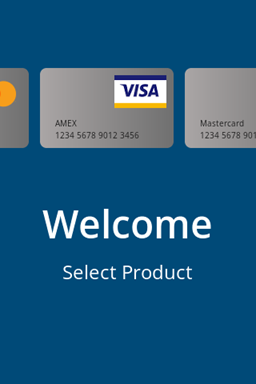
The carousel screen is a general purpose starting screen. The function of the carousel is to display supported brands and as a call to action for the cardholder to start interacting with the terminal. This is a relatively complex screen. It supports a minimum of 3 cards which are variously a container, image, and several labels. There is a 'title' and 'subtitle' label and then two differently sized buttons, one which contains a label and the other a image.
Whilst this screen was originally very popular, as familiarity with Payter solutions have grown most organisations have chosen to use a more branded or themed 'Start Screen' e.g. one that resonates with the wider solution branding.
Partners are welcome to base their own screens directly on these built-in screens, or simply take inspiration from them and build screens directly.